Integrating the Payment Security Icon Pack into Real-World Design Workflows
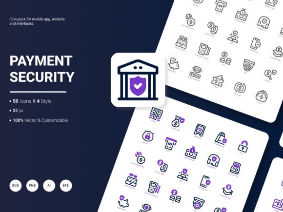
When trust is the currency of digital transactions, visual cues become your most immediate handshake with the user. The Payment Security Icon Pack fills a specific gap that many designers, developers, and business owners encounter: the need to quickly communicate safety, encryption, and payment reliability without reinventing a design language from scratch. Rather than just another set of generic symbols, this collection packages 200 intentionally styled icons that reflect popular payment services, security concepts, and modern financial ideas. Understanding how this resource slides into your actual process—from early planning to long-term asset maintenance—can save hours of friction and produce a more consistent, professional result across your website, app, presentation deck, or analytical report.
Where Icons Sit in the Visual Trust Equation
Every interface that handles money carries an invisible burden of proof. Icons act as signposts that reduce cognitive load: a padlock, a shield, a verified payment method logo, or a simple SSL badge tells the story before a sentence of copy does. But achieving that clarity demands that the icons not only look current but also remain consistent in weight, color logic, and metaphor. The Payment Security Icon Pack was built precisely for this reason. It offers four distinct styles so you can match the visual density of your brand—whether you need thin, outlined line art for a sleek fintech dashboard, solid filled shapes for an e‑commerce mobile app, or a more illustrative treatment for infographics and slide decks. Having that range inside a single, organized folder means you avoid mixing mismatched icon sets from different sources, which is a common culprit behind amateur-looking layouts.
Unpacking the Pack: What’s Actually Inside
Before integrating any resource, it pays to audit its adaptability to your tool stack. The Payment Security Icon Pack arrives in six file formats: AI, EPS, SVG, PNG, PDF, and JPG. That list might seem like alphabet soup, but it directly maps to different stages of a project. For example:
- AI and EPS give you fully editable vector source files. You can open these in Adobe Illustrator, Affinity Designer, or Sketch to recolor, resize, or tweak stroke properties without losing sharpness.
- SVG is lightweight, resolution‑independent, and ideal for web and mobile development. You can drop SVG code directly into HTML, style it with CSS, and even animate it with JavaScript.
- PNG provides ready‑to‑use raster versions at multiple sizes, perfect for quick drag‑and‑drop into presentation software, Word documents, or blog post graphics.
- PDF vector files retain editability and are often used in high‑end print or analytical report layouts.
- JPG offers a quick, compressed option when file size is a concern and transparency isn’t needed.
Beyond formats, the 200 icons are explicitly tagged around popular content: credit card symbols, mobile wallets, encryption shields, fingerprint scans, Bitcoin and cryptocurrency motifs, secure checkout flows, and compliance badges. This pre‑structured taxonomy means less time spent naming files and more time placing the right metaphor in front of the right user.
Preparing Your Workflow to Accept the Icon Set
Effective visual asset management starts before you open the first canvas. When you receive the Payment Security Icon Pack, spend a few minutes creating a master folder structure that aligns with your team’s naming conventions. For instance, sort source files by style (line, solid, duotone, flat) or by use case (mobile, web, print). This small upfront investment prevents the “where did I save that shield icon?” panic later. If you work inside a design system tool like Figma or Adobe XD, import the SVG or EPS files into a dedicated component library. Because the icons are editable, you can globally apply your brand’s accent colors to the entire set, establishing a single source of truth. One of the most practical exercises is to open the AI or EPS file, build a shared color palette from your brand guidelines, and batch‑recolor the icons. From that point on, any designer on the team pulls a ready‑to‑use asset that already sings in brand harmony.
Practical Implementation Across Different Media
Icons rarely live in isolation. They interact with typography, spacing, form fields, and surrounding UI elements. Let’s walk through how the Payment Security Icon Pack fits into several common project types.
Website and Mobile App Design
During wireframing, you might use placeholder shapes. But as you move into high‑fidelity mockups, swapping those placeholders with crisp, meaningful icons from the pack clarifies the user journey. A “secure payment badge” icon placed near a checkout button can reduce cart abandonment when it echoes the visual language customers already associate with safety. Because you have access to both SVG and PNG formats, you can export the exact dimensions needed for retina displays without introducing blur. Developers will appreciate that SVG icons can be compressed and, in many cases, inlined directly into HTML to reduce HTTP requests—an important performance consideration for payment pages where load time directly affects conversion.
Presentations, Analytical Reports, and Infographics
When you’re explaining quarterly fraud statistics or proposing a payment security audit to stakeholders, the story lives in the mix of data and visual hooks. Here, the PDF and PNG formats become your go‑to. Insert a well‑chosen icon next to a key statistic, and abstract numbers suddenly connect to a concrete idea. The four available styles let you maintain visual hierarchy: perhaps outlined icons for section headers and solid icons for bullet points. Because the collection includes icons for mobile payments, biometric authentication, and network security, you can build a cohesive visual narrative across 30 slides without hunting for new imagery each time.
Templates and Reusable Layouts
Many teams maintain internal template libraries for marketing emails, landing pages, or client proposals. Embedding icons from this pack into template components means future projects launch faster. Since the AI and EPS files are editable, you can even customize icon details to match campaign‑specific themes—for example, adjusting the corner radius of a lock icon to better match a softer brand personality. This single‑source flexibility turns a static asset into a living part of your brand toolkit.
Maintaining Visual Consistency As Projects Scale
Consistency doesn’t happen by accident; it’s a practice. With 200 icons, the risk of visual entropy is real if different team members grab different versions. Implement a lightweight quality‑control checkpoint. Before pushing any design to review, verify that all payment‑related icons come from the same style family. The pack’s four styles act as a natural guardrail: pick one style for the primary interface and a complementary one for secondary touchpoints only when necessary. Also, leverage the editable nature of the source files to document your icon‑usage rules. A simple internal guide could state: “All security icons must use a 2px stroke weight, #1A73E8 color, and a 24x24px grid.” Because the source vectors are open, such global changes are a matter of minutes, not hours.
Long‑Term Use and Asset Management
A well‑maintained icon library doesn’t expire. Over time, your payment interface may evolve: you add a new payment gateway, support a cryptocurrency, or highlight a new compliance standard. Instead of commissioning a new custom icon or force‑fitting a mismatched symbol, you can open the original AI file, duplicate an existing icon, and adapt it while preserving the core style DNA. The pack’s 200‑icon starting point covers most mainstream services, but its real value grows when you treat it as an extensible foundation. Keep a changelog inside your asset folder so that new additions stay organized. If you’re in a fast‑moving startup, a junior designer can quickly produce on‑brand icons without external help, reducing bottlenecks during marketing sprints or product launches.
Another long‑term benefit is cross‑platform cohesion. If your brand presence spans a website, a native iOS app, and printed POS materials, the ability to export the same icon concept as crisp SVG for web, PDF for print, and PNG for social posts means customers encounter a unified security language everywhere. That repetition silently reinforces trust—a psychological underpinning that no amount of marketing copy can replicate.
Observations from Real-World Integration
In practice, the most frequent friction point isn’t the icon quality but the organizational habit around using them. Teams that adopt a “component‑first” mindset see the fastest payoff. By treating the Payment Security Icon Pack as a design system component rather than a one‑off download, they cut iteration time during usability testing. For example, after observing that users hesitated on a payment screen due to unclear trust signals, a product team could quickly swap a generic lock with a more explicit “SSL Encrypted” badge from the pack, export it via SVG, and A/B test the change. That speed of experimentation—enabled by an organized, editable, multi‑format library—directly influences conversion metrics and user confidence.
Another overlooked advantage is onboarding. When new designers join a project, a clearly labeled icon folder flattens the learning curve. Instead of asking peers for asset locations or spending hours browsing stock sites, they can immediately contribute to high‑priority screens. This subtle gain in productivity compounds across sprints.
What’s Next: Ideas for the Icon Set’s Future Updates
No icon pack can anticipate every niche requirement, and the payment security landscape constantly shifts. If you’ve used the Payment Security Icon Pack in your projects, think about what routinely comes up that’s missing. Perhaps you want a dedicated “Open Banking” symbol, a biometric‑specific face‑scan icon, a series of PSD2‑compliant badges, or a set focused on decentralized finance (DeFi) wallets and bridges. The creators of the pack actively seek suggestions for the next update, so your real‑world usage directly shapes what gets added. By sharing the concepts you found yourself having to illustrate manually, you help build a more exhaustive resource that serves not just your team but a wider community of designers and developers navigating the same trust‑communication challenges. Drop a note through the provider’s contact channel with your wish list—whether that’s more regional payment icons, layered animation‑friendly SVGs, or even a dark‑mode‑optimized variant. That collaborative loop keeps the asset fresh and relevant far beyond the initial download.
Ultimately, a versatile icon pack fills the role of a silent assistant in your creative process. It removes the friction of starting every trust‑signal design from zero, letting you focus on the arrangement, the messaging, and the user flow—the parts of the work that require distinctly human judgment. When the assets are editable, multi‑format, and thematically curated, they stop being just a folder of files and start acting as a flexible extension of your design methodology.