Smart Ways to Use the Retail Industry Icon Pack for Clearer Visual Communication
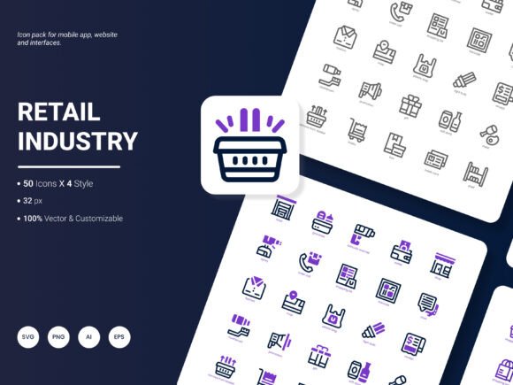
Icons shape how quickly customers understand your retail website, app dashboard, or presentation slide. When done right, a well-chosen icon set removes friction and makes ideas instantly recognizable. When done poorly, it confuses visitors, weakens your brand, and forces people to guess what a button actually does. The Retail Industry Icon Pack bundles 200 stylish icons around popular retail services and ideas—shopping, payments, loyalty, inventory, customer flow, and more. In its current form, this collection includes flexible file formats, multiple styles, and fully editable source files, making it a strong foundation for anyone building retail-focused designs.
Why an icon set built for retail makes a difference
Generic icon libraries are tempting. You download a free set, find a cart icon, a barcode, a percentage symbol, and call it a day. But retail communication relies on specific visual language: a return label, a fitting room symbol, a gift receipt, a contactless payment icon, a curbside pickup indicator. When these are missing, designers often force-fit unrelated metaphors—a package box instead of a click-and-collect locker, or a dollar sign for a refund policy. Those approximations slowly erode clarity. The Retail Industry Icon Pack was built specifically with these retail moments in mind. The 200 icons cover not just obvious e-commerce cues but also loyalty programs, price tags, store navigation, and seasonal sales graphics. This saves you from the patchwork approach that makes your final output look inconsistent.
Common pitfalls when choosing an icon pack — and how to avoid them
It is easy to focus on quantity and ignore quality signals. Many people download a large pack, use a handful of icons, and quickly notice that the set lacks the exact metaphor they need or that the icons don't scale well. Others pick a pack because the preview images look trendy, but later discover the source files are flattened or difficult to recolor. These mistakes lead to wasted time, extra editing work, or a finished design that feels clumsy. Let’s look at realistic examples of where things go wrong and how to correct them.
Mistake 1: Judging icons only by the preview, not by the formats
A glossy presentation page can hide severe format limitations. I have seen teams grab an icon set labeled “vector,” only to realize that the editable version came in a single format their design tools couldn't open cleanly. When you need to recolor a shopping bag icon for a dark mode interface or adjust the stroke weight of a wallet symbol for a mobile app, opening a layered file matters. The Retail Industry Icon Pack ships with six practical formats: AI, EPS, SVG, PNG, PDF, and JPG. This means you can open the vectors in Adobe Illustrator or any compatible software, drop SVG code directly into your website, use high-resolution PNG for social media templates, and keep a PDF version on hand for print materials. Before committing to any set, check whether your primary tools can consume the files without conversion headaches. If you rely on Figma or Sketch, for example, importing EPS or AI may require extra steps, while SVG tends to work seamlessly. Always confirm that the format you need most is actually included and not just promised as an on-request bonus.
Mistake 2: Mixing too many icon styles in one project
Designers sometimes load a pack with four style variations and think they can freely combine them across a single interface. The Retail Industry Icon Pack includes four distinct styles. You might have solid, outline, flat, or duotone options. Each style serves a specific visual tone. A solid style works well for prominent call-to-action buttons; outline icons feel lighter in navigation bars; duotone icons can add warmth to promotional banners. The mistake is grabbing a sale tag from the solid style, a cashback icon from the line style, and a store locator from the duotone collection—all on the same page. Visitors perceive that inconsistency, even if they can’t name it. Their eyes struggle to group related actions.
A better approach: pick one primary style for your main interface elements and, if needed, use a secondary style sparingly for a clear purpose—maybe a different visual category. Test a small section first. Look at your product card icons, your header menu, and your checkout steps side by side. Do they feel like they belong together? If you’re unsure, stick to a single style across the entire user flow. Since the pack is fully editable, you still have room to adjust line thickness or color to fine-tune cohesion without introducing visual noise.
Mistake 3: Ignoring how icons reproduce at small sizes
Retail interfaces often cram a lot of information into tight spaces—think product filtering options, size selectors, or quick action buttons on mobile screens. An icon that looks crisp at 200 pixels can become a muddy blob at 20 pixels if you aren’t careful. The natural assumption is that vector icons will scale forever, but complex retail icons with tiny details (like a credit card with a chip plus a wifi symbol for contactless) need legibility checks at the intended display size. Fortunately, having editable vector files from the Retail Industry Icon Pack helps. You can simplify details, increase spacing, or slightly thicken strokes for smaller viewports. Before finalizing your design, export the icons at the smallest size you’ll actually use and review them on a real device. If a loyalty star icon or a stacked-coin refund icon becomes hard to read, consider a simpler alternative from the same pack or edit the shape to remove unnecessary inner lines.
Mistake 4: Overlooking color flexibility and brand alignment
Even a well-drawn icon set can sabotage your visual identity if you don’t adapt the colors. Some people download a pack and use the default presentation colors—maybe bright orange carts and turquoise gift boxes—without adjusting them to their brand palette. The result is a visual mismatch that separates the icons from the rest of the design. Icons should inherit your brand’s primary, secondary, or neutral tones. Because the Retail Industry Icon Pack offers fully editable source files, you can recolor any icon in a few clicks. Don’t settle for the demo colors. Use your brand’s specific hex codes, and consider making icon sets monochromatic for menu systems or tinting them for on-hover states. If you’re embedding SVG code directly into a website, you can control colors via CSS for dynamic theme support.
Mistake 5: Using raster formats where vectors would perform better
High-resolution PNGs are convenient, but for digital products—especially responsive websites and mobile apps—scalable vector graphics prevent blurry visuals on high-density screens. This pack includes both SVG and PNG options, but I often see people default to PNG out of habit. That’s fine for social media graphics or printed flyers, but if your retail interface needs to adapt across device widths, SVG gives you infinite resolution without larger file sizes. When you need a store location pin that stays sharp on a 4K monitor and a tiny smartwatch screen, lean on the SVG version. The pack’s PDF and EPS files also let you extract vector art for print materials where quality must stay pristine on large signage.
Making the most of editable retail icons in real workflows
The fact that these icons are editable changes how you can use them across different outputs. Suppose you’re designing an analytical report on customer footfall. You might pick a person icon from the solid set, a heatmap grid, and a chart-like metric symbol. If the person icon’s scale feels too small alongside your custom data visualization, you can adjust it without losing quality. Similarly, when building an email template, you might want to lighten the opacity of a gift box icon to use as a subtle background element. Because you have vector control, that tweak takes seconds rather than requiring a search for a replacement.
Another overlooked advantage: you can extract parts of icons to create new symbols. A common retail scenario: you need a “click and collect” combination, but the pack has separate icons for a store and a package. By overlaying or merging editable paths, you can craft a custom metaphor that still shares the family DNA of the original icon set. This keeps your design system consistent without waiting for the next update.
What to check before finalizing your purchase or download
If you have already decided that the Retail Industry Icon Pack fits your project, spend ten minutes checking a few practical items. First, open one of the vector files in your design software. Confirm that the layers or groups are organized in a way you understand. Messy layer structures can slow down editing. Next, check a few raster exports at the sizes you need. The pack includes JPG and PNG, but sharpness can vary; verify the resolution is at least 300 DPI for print assets. Then, test an SVG icon in your web project to ensure the markup is clean and doesn’t include unnecessary inline styles that overwrite your CSS. Finally, scan the icon index to see if all the retail topics you represent—maybe cashback, barcode scanning, fitting rooms, price matching—are covered. If a handful are missing, the editable nature of the set lets you adapt existing icons, but you should know the scope upfront.
A note on future updates
Every icon pack evolves with community input. Right now the Retail Industry Icon Pack covers a solid range of popular services and ideas across four styles and six formats. If you have specific retail scenarios you wish were represented—like sustainable packaging, same-day delivery badges, augmented reality try-ons, or integrated checkout flow symbols—sharing that feedback helps shape the next release. Compact icon sets thrive when they reflect real-world retail language. Whether you’re a marketer building seasonal campaign visuals, a startup founder designing an app onboarding flow, or a business owner updating a loyalty program presentation, a well-maintained icon pack reduces the need to hunt down new assets each time your retail messages shift.
Using icons well isn’t about owning the largest library. It’s about picking a coherent, flexible set that aligns with your message, and then applying it with attention to detail. Avoid style clashes, test at real sizes, recolor to match your brand, and choose the right format for the medium. Small corrections like these keep your visuals professional and your communication immediate, without costly redesign cycles later.